Clarity
Shapes signal function, motion signals risk. We avoid ornamentation that competes with meaning.
- One accent color for callouts.
- Predictable iconography across worlds.

Clarity first, flair second. We design for instant reads and graceful failure states.
Lok Digital is a love letter to readable play. We believe the more a player understands the board at a glance, the more the game can demand in precision and courage. Removing decorative noise creates room for meaningful decisions.
Our vision is to ship a game that respects your time, your device, and your skill—especially in India, where hardware diversity is a reality and ambition runs high. Every choice in art, code, and sound supports this clarity.

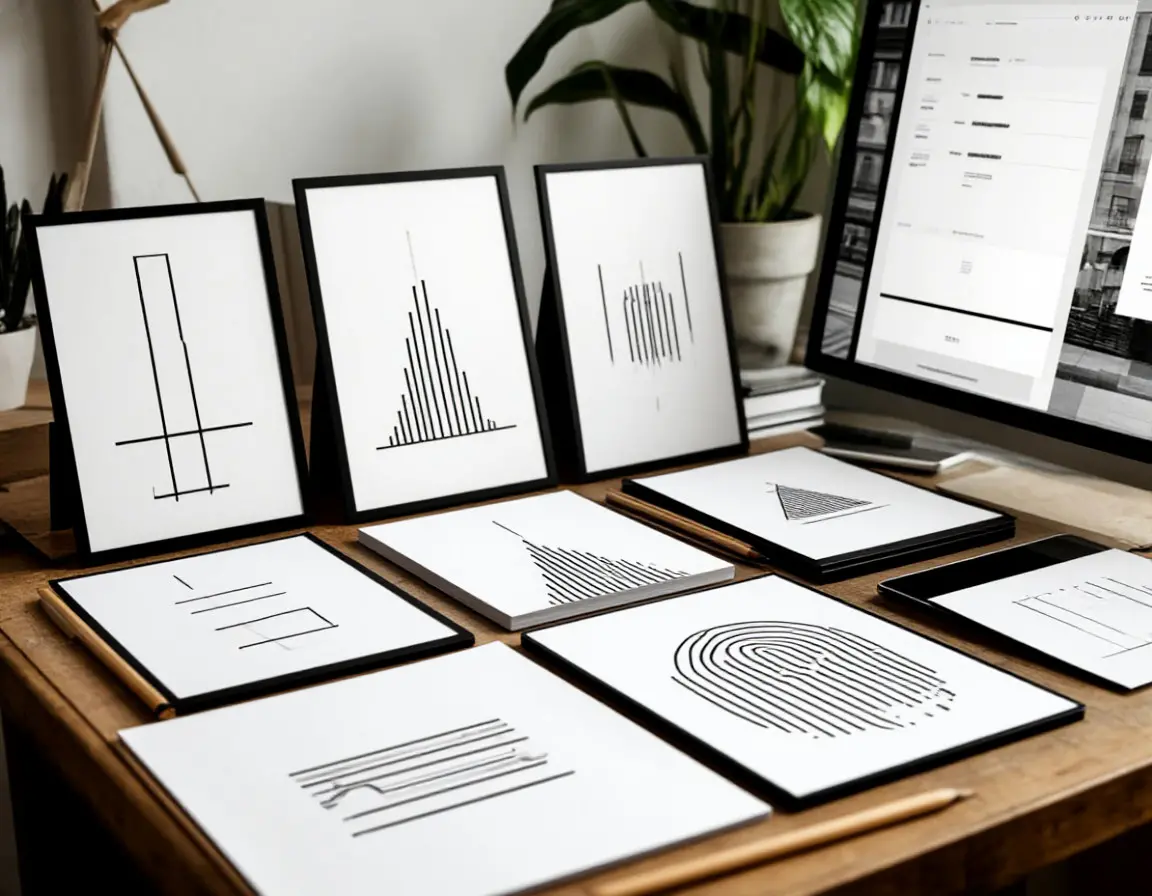
The idea grew from paper sketches that simplified busy game boards into a few strong shapes. Those studies became prototype lanes with explicit timing windows. When playtesters started annotating runs like music, we knew we had a direction.
We built systems that teach by doing, not by lecturing. Failure states are legible, and success leaves a trail you can trace and repeat. The restraint in visuals is a promise: if you read correctly, you will act correctly.
Shapes signal function, motion signals risk. We avoid ornamentation that competes with meaning.
Score formulas and multipliers are shown in-game. If something affects your route, you can measure it.
Inputs are buffered with consistent latencies so perfect strings feel earned and repeatable.
Lane reads, bounce tests, and first-pass HUD. Early playthroughs revealed how much clarity boosts courage. We wrote an art bible focused on shapes that carry meaning, not decoration.
Control curves stabilized across touch and gamepad. We validated input buffering to preserve intent and reduced variance in frame pacing to keep arcs consistent.
Endless seeds, leaderboards, and performance profiling across common Indian devices. We introduced decoys to challenge greedy routes while keeping fairness intact.
Players reported fewer “unreadable” moments thanks to consistent bounce angles and clearer negative space around hazards.
Cosmetics, Trials, and polish passes on input feel. We added soft multiplier decay to reward recovery instead of punishing experimentation.
Final performance sweeps, accessibility audits, and device compatibility checks. Store carries cosmetics only—no pay-to-win.
Post-launch roadmap includes new worlds, balance tweaks, and deeper analytics on readability and recovery behavior.
The minds behind our clarity-first design, each bringing a unique skill set to create an experience that’s readable, fair, and unforgettable.

Game Director
Guides the vision for clarity-first design and makes sure every decision supports readable play.

Lead Engineer
Owns performance, input feel, and platform parity so Lok Digital plays the same everywhere.

Art & UX
Defines the monochrome grammar that lets players parse states instantly.
Critics and players alike are talking about our approach—fair, focused, and built for the way games are played today.
A minimalist aesthetic that amplifies mechanics instead of hiding them.
Scores and unlocks that respect players’ time and skill.
Runs great on everyday devices without compromising feel.
We’re polishing the last edges. Follow updates, read the latest notes, and get ready to run.